Visual Identity for Geophysics Company
Campbell & Walker are Geophysics specialists who deliver consulting and interpretation services for exploration projects worldwide, related to exploration for mineral, groundwater and energy resources.
Design bloke was asked to design a new logo and create style guides for the new website.
When Sean from Walker & Campbell Geophysics first chatted through his wish for a new visual identity, he was quite keen to have something that represented his Canadian roots and Scottish home, combined with something that landed clearly in the Geophysics realm.
In the end, i'm glad to say, we went with something a lot more iconic, simple and balanced. Something that is more appropriate for the sector he works in.
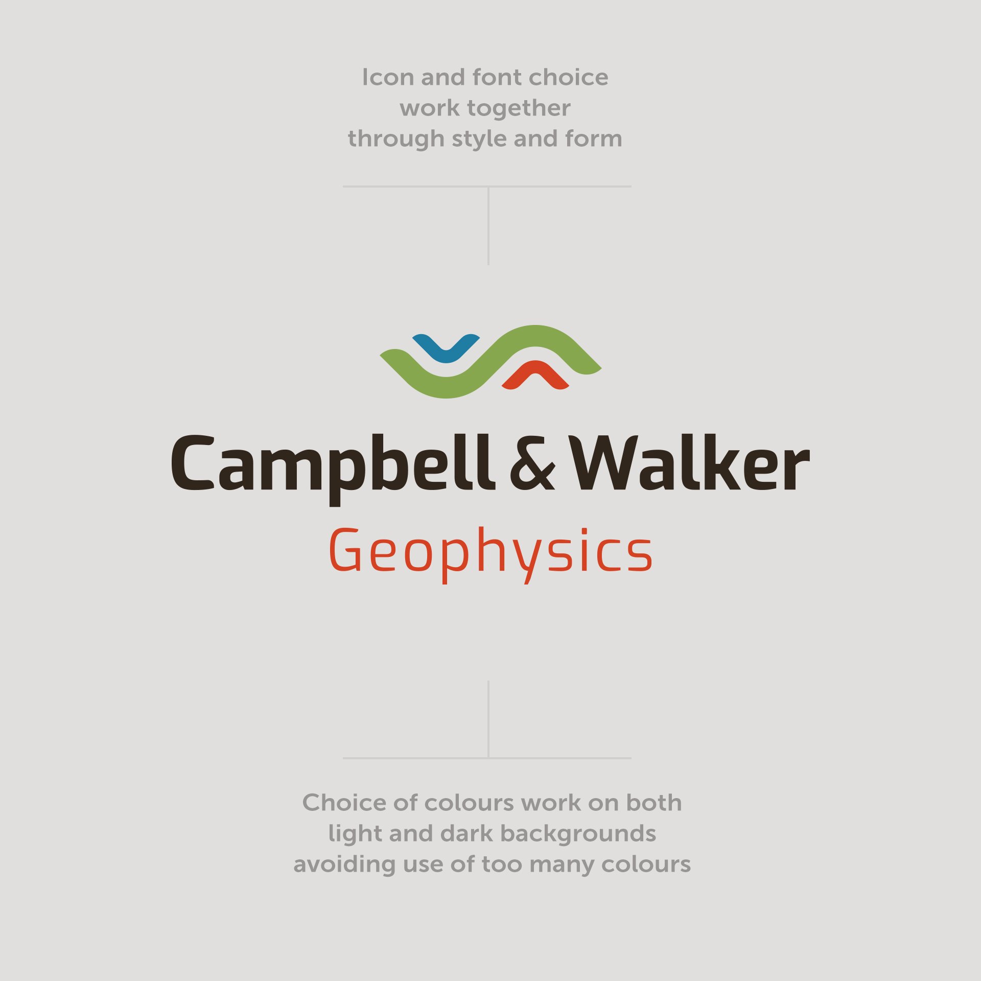
Campbell & Walker are consulting and interpretation services for exploration projects worldwide, related to exploration for mineral, groundwater and energy resources. The logomark design tells the story of taking scans, taken from above U shaped valleys and high mountains, to identify the deposit below.
The font is customised to match the shape and the colours are relevant to the various data maps that the team at CW Geophysics produce in their interpretation of the data they work with.
When I work on a new logo design, I always give my client a mini brand guide as part of the process.
I worked with CW Geophysics to style a new website which is built on the Squarespace platform. I love working with Squarespace for smaller website builds like this. I'll talk more about that in a future post. For now, there's only one page, but more is in the works.
If you need a new logo, visual identity, or need a new website, please do get in touch.
#logodesigner #brandidentity #visualguidelines #brand #squarespace


